May 2, 2026
Written and edited by Anwar
Anwar founded HandwritingTool and edits the site's guides on handwriting conversion, page layout, printable documents, and writing workflows.
Updated June 8, 2026. Each guide is reviewed for clarity, practical usefulness, and responsible page-creation workflows.
How to Make Handwriting Look Realistic Online
Making handwriting look realistic online is not only about choosing a handwriting font. A natural handwritten page depends on letter shape, letter spacing, word spacing, line height, paper texture, ink color, margins, paragraph length, and the way the final PDF or image is exported.
Many generated handwriting pages look too perfect, too crowded, or too digital because the settings are not balanced. Real handwriting has rhythm. Letters do not sit with machine-like spacing. Lines have room to breathe. Ink has contrast. Paper gives the writing context. The goal is not messy output; the goal is believable handwritten-style output that remains easy to read.
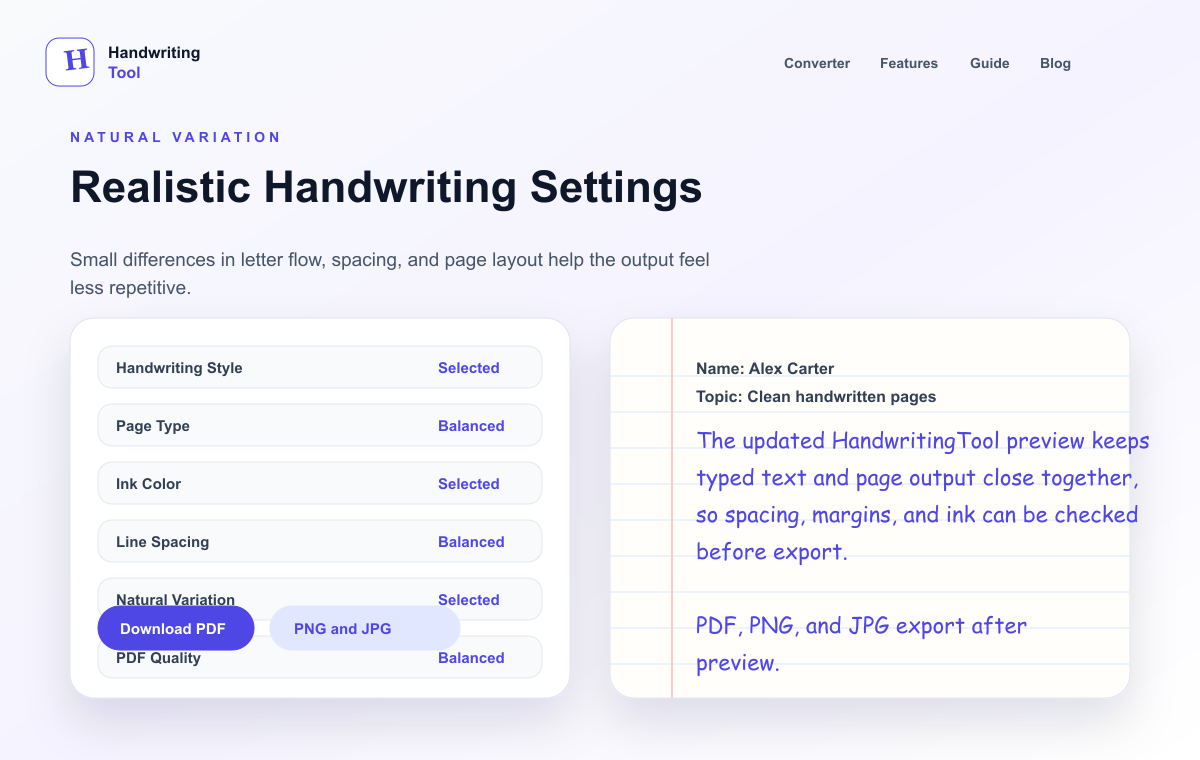
This guide explains the specific settings that make online handwriting look more realistic, including letter spacing, ink color psychology, paper texture effects, and a comparison table of realistic vs unrealistic settings.
If you are new to the full workflow, start with our how to convert text to handwriting guide. If you want full page output, read create handwritten pages online free. If you are comparing tools, see the best text to handwriting tools comparison.
What Makes Online Handwriting Look Realistic?
Realism comes from many small decisions working together. A good handwriting style can still look fake if the page has no margins. A nice paper background can still look artificial if the letters are packed too tightly. A believable ink color can still feel wrong if the paragraph is one huge block with no natural breaks.
The most important realism signals are:
- Readable handwriting style
- Natural letter spacing
- Comfortable word spacing
- Balanced line spacing
- Medium font size
- Blue or black ink for most documents
- Paper texture that matches the content
- Proper margins
- Shorter paragraphs
- Careful preview before export
The best results usually come from moderate settings. Extreme font sizes, bright ink colors, and crowded spacing make generated handwriting look less natural.
Choose a Readable Handwriting Style
The handwriting style is the first thing people notice, but it should not be the only thing you adjust. For realistic output, choose a style that looks like regular writing, not a decorative title font.
A readable handwriting style should have clear letter shapes, natural curves, consistent baseline behavior, and enough distinction between similar letters like a, o, e, r, and n. If the style looks beautiful in one word but hard to read in a paragraph, it is not the right style for a full page.
Use expressive or cursive styles for short quotes, greeting lines, and decorative text. Use clean print-style handwriting for longer notes, documents, worksheets, journal pages, and printable content.
Use Natural Letter Spacing
Letter spacing is one of the most overlooked settings. Real handwriting rarely has perfectly equal space between every letter. Some letters naturally sit closer together, while others create more open shapes. If a generator allows spacing adjustments, avoid extremes.
Tight letter spacing can make words look compressed and hard to read. Wide letter spacing can make the text look like a font sample rather than handwriting. The best setting is usually close to normal with a slight openness if the handwriting style is narrow.
Use this rule:
- If letters touch or blur together, increase spacing slightly.
- If words look stretched or mechanical, reduce spacing.
- If the page feels stiff, adjust line spacing and margins before making letter spacing extreme.
Letter spacing should support readability without calling attention to itself.
Keep Word Spacing Comfortable
Word spacing affects the rhythm of the whole page. If words are too close, sentences feel crowded. If words are too far apart, the page looks broken. Realistic handwriting usually has enough separation to read quickly, but not so much that the line feels fragmented.
For long paragraphs, slightly open word spacing can help. For short phrases, normal spacing is usually better. Avoid wide spacing as a shortcut for realism; it often creates the opposite effect.
Use Medium Font Size
Font size can make or break a handwritten page. Very small writing may fit more text, but it can look compressed and become difficult to read. Very large writing can look like a poster or practice sheet instead of normal handwriting.
Medium font size usually gives the best balance. It keeps the page readable while still making the writing feel natural. If the page looks crowded, split the text into shorter paragraphs or increase line spacing before shrinking the font too much.
Adjust Line Spacing Carefully
Line spacing is a strong realism signal. Real handwritten pages need room for tall letters, descenders, and natural movement. When lines sit too close together, the page feels computer-generated. When lines are too far apart, the writing feels disconnected from the paper.
Use moderate line spacing for most notes and documents. For journal pages or greeting card drafts, slightly open spacing can feel warmer. For compact printable documents, normal spacing can work if the font is still readable.
Always preview more than one paragraph. A spacing setting that looks fine in a short sample may feel crowded across a full page.
Understand Ink Color Psychology
Ink color changes how the page feels before anyone reads the words.
Blue ink feels casual, familiar, and note-like. It is often the best choice for notebook pages, journal-style pages, drafts, and friendly messages. Black ink feels cleaner, more formal, and more polished. It works well for printable documents, worksheets, recipe cards, letters, and design mockups.
Gray ink can feel soft and subtle, but it may print poorly if contrast is too low. Red, green, purple, and other bright colors can work for labels, headings, annotations, or creative visuals, but they rarely look natural across long paragraphs.
For realistic full pages, start with blue or black. Add color only when the project needs it.
Use Paper Texture Intentionally
Paper texture affects realism because handwriting needs a believable surface. Plain white paper can look clean, but it may also feel digital if the writing is too perfect. Lined paper gives structure and makes the page feel like a notebook. Graph paper suggests planning, diagrams, measurements, and technical notes. Subtle texture can make the page feel warmer and less flat.
The key word is subtle. Heavy texture can distract from the text. Dark paper backgrounds can reduce readability. Overly decorative paper can make the page look like a template instead of real writing.
Choose paper based on the content:
| Content Type | Best Paper Choice | Why | | --- | --- | --- | | Notes or drafts | Lined paper | Familiar and easy to scan | | Clean documents | Blank paper | Polished and less distracting | | Planning pages | Graph paper | Supports structure and alignment | | Journal pages | Lined or lightly textured blank paper | Personal and warm | | Design mockups | Blank or subtle texture | Easy to place into layouts |
Realistic vs Unrealistic Settings
Use this table as a quick diagnostic when a page does not look right.
| Setting | Realistic Choice | Unrealistic Choice | Why It Matters | | --- | --- | --- | --- | | Handwriting style | Simple, readable, natural | Highly decorative for long text | Readability makes the page believable | | Letter spacing | Normal or slightly open | Very tight or very wide | Extreme spacing looks mechanical | | Word spacing | Comfortable and consistent | Crowded or stretched | Word rhythm affects the whole page | | Line spacing | Moderate with breathing room | Lines almost touching | Real writing needs vertical space | | Font size | Medium | Very tiny or oversized | Size should feel like normal writing | | Ink color | Blue or black | Bright colors across full paragraphs | Familiar ink colors feel more natural | | Paper | Lined, blank, graph, or subtle texture | Busy decorative background | Paper should support the content | | Margins | Clear left/top margins | Text touching page edges | Margins make the page feel written | | Paragraphs | Short sections | One dense block | Human writing usually has breaks | | Export | PDF for print, PNG for sharp image | Low-quality compressed output | Export quality affects realism |
Add Proper Margins
Margins are easy to ignore, but they are essential. Writing that starts too close to the page edge looks rushed and digital. A left margin gives the page structure. Top and bottom spacing prevent the text from feeling squeezed.
For a natural page, leave enough room around the text. Wider margins work well for letters, journal pages, greeting card drafts, and recipe cards. Normal margins work well for worksheets, printable notes, and documents.
Break Long Paragraphs
Generated handwriting often looks fake when the input is one huge block of text. Shorter paragraphs create natural rhythm and make the page easier to read.
Before converting text, edit the structure:
- Add a short heading if needed.
- Split long paragraphs.
- Remove repeated spaces.
- Keep lists clean.
- Preview a full page, not one line.
The converter can only style the content you give it. Clean source text creates cleaner handwritten output.
Avoid Overly Perfect Output
Perfect output can look artificial. Real handwriting has slight irregularity in spacing, flow, and rhythm. That does not mean the page should be messy. It means the page should avoid looking like a rigid digital font dropped onto paper.
To reduce the overly perfect look, use a natural handwriting style, medium size, balanced spacing, normal paper, and clear margins. A page that is readable but not stiff usually feels the most realistic.
Check the Preview Before Downloading
Preview is the quality control step. Before exporting as PDF, PNG, or JPG, look at the full page carefully.
Check for:
- Text too close to an edge
- Lines too crowded
- Font too decorative
- Words difficult to read
- Paragraphs too long
- Low ink contrast
- Cropped export
If something feels off, adjust one setting at a time. Small spacing and margin changes often produce the biggest improvement.
Choose the Right Export Format
PDF is best for printing, archiving, and multi-page documents. PNG is best for sharp image previews and design use. JPG is useful for smaller files and quick sharing, but compression can soften fine handwriting details.
For realistic output, export at the highest practical quality. If text looks blurry after export, use PDF or PNG instead of JPG.
FAQ
How can I make generated handwriting look real?
Use a readable handwriting style, medium font size, natural letter spacing, balanced line spacing, blue or black ink, suitable paper, clean margins, and short paragraphs. Preview the full page before downloading.
Why does my online handwriting look fake?
It usually looks fake because the font is too decorative, spacing is too tight or too wide, margins are missing, paper style does not match the content, or the export is low quality.
Is blue or black ink more realistic?
Both can be realistic. Blue feels casual and note-like. Black feels cleaner and more professional. For long documents, one of these two colors is usually safer than bright colors.
Does paper texture make handwriting look better?
Subtle paper texture can make a page feel warmer and less digital. Heavy texture can reduce readability, so choose paper that supports the content rather than distracting from it.
Should I export realistic handwriting as PDF or image?
Use PDF for printing and documents. Use PNG for sharp images or design work. Use JPG only when smaller file size matters more than maximum sharpness.
Final Thoughts
Realistic handwriting is built from small choices: letter spacing, word spacing, line spacing, ink color, paper texture, margins, paragraph length, and export quality. A good handwriting font helps, but the full page decides whether the result feels natural.
Start with moderate settings, preview the whole page, and adjust one detail at a time. When the writing is readable, well-spaced, and matched to the right paper, generated handwriting can look much more believable.
Try HandwritingTool for free and create realistic handwritten pages online in minutes.
Use the Converter Responsibly
HandwritingTool is best for readable notes, drafts, worksheets, examples, journal pages, printable resources, and document previews. Review your output carefully before printing or sharing it.