Guides • August 1, 2026
Written by Anwar Fakhri
Anwar Fakhri founded and maintains HandwritingTool, and writes and edits its practical guides about handwriting conversion, page layout, printable documents, and responsible writing workflows.
Updated August 1, 2026. Each guide is reviewed for clarity, practical usefulness, and responsible page-creation workflows.
Best Text to Handwriting Settings for Realistic Output
Realistic text-to-handwriting output does not come from choosing the most decorative font. It comes from making the handwriting, paper, spacing, margins, ink, and source text agree with each other.
A notebook page looks more convincing when the writing follows its ruled lines. A lab record needs a restrained style that stays readable over a grid. A personal note can use more open spacing, but a multi-page PDF needs predictable margins and conservative variation. One "perfect" setting cannot handle all four jobs.
This guide documents practical starting values from the presets currently built into HandwritingTool. The screenshots were captured from the working converter, not prepared as separate design mockups. Treat the numbers as controlled starting points: paste your real text, inspect the complete page, and make small adjustments when the content wraps differently.
Open the text to handwriting converter
Reference, not a walkthrough: this page is a settings cheat-sheet with exact starting values. If you want the full step-by-step workflow instead, start with how to convert text to handwriting.
Quick Settings Table
| Output | Style | Paper | Ink | Size | Line spacing | Word spacing | Variation | Left / top margin | |---|---|---|---|---:|---:|---:|---:|---:| | General worksheet | Clear Print | Lined | Blue | 34 | 1.55 | 1.00 | 0.38 | 165 / 120 | | Class notes | Clean Notes | Lined | Blue | 32 | 1.45 | 0.95 | 0.32 | 150 / 105 | | Neat notebook | Neat Margin | Lined | Blue | 30 | 1.50 | 1.05 | 0.22 | 170 / 115 | | Revision notes | Clean Notes | Lined | Black | 31 | 1.55 | 1.00 | 0.26 | 170 / 115 | | Lab record | Lab Record | Graph | Black | 30 | 1.50 | 0.95 | 0.28 | 155 / 110 | | Simple personal note | Daily Notebook | Blank | Blue | 32 | 1.50 | 1.00 | 0.30 | 145 / 110 |
These are not universal measurements for every handwriting generator. They are the actual control values used by the corresponding HandwritingTool presets as of the update date above.
Start with the Page, Not the Handwriting Style
Paper determines how much freedom the writing has.
Lined paper is the safest choice for notes, worksheet examples, letters written in a notebook style, and longer paragraphs. The horizontal rules make inconsistent line height obvious, so font size and line spacing need to work together.
Blank paper suits short letters, journal layouts, quotes, recipe cards, and design drafts. Because there are no baselines, wide paragraphs can look as if they are floating. Use shorter sections and enough top margin to give the page a clear starting point.
Graph paper adds visual density before any text is rendered. Use a smaller, simpler handwriting style, black or dark ink, and restrained variation. Large cursive text competes with the grid and becomes harder to scan.
Paper size matters separately. Choose A4 when that is the paper available to your printer; choose Letter for a Letter-size workflow. Changing the page size after tuning a layout can alter wrapping and page count, so select it early.
Setting 1: Readable Lined-Paper Notes
For ordinary notebook output, begin with Clean Notes, blue ink, font size 32, line spacing 1.45, word spacing 0.95, and variation 0.32. The Class Notes preset uses a left margin of 150 and a top margin of 105.
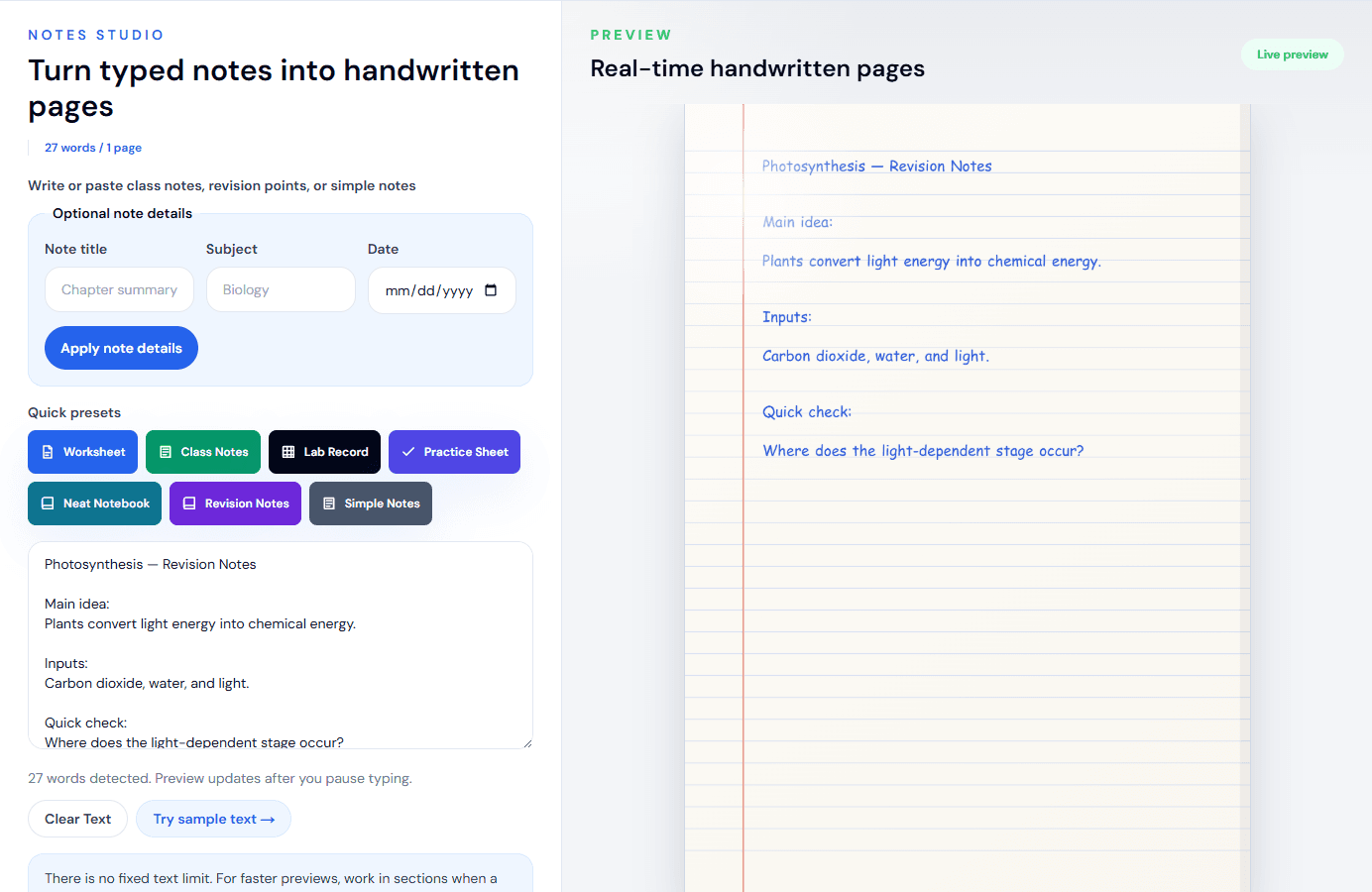
Why this combination works:
- Size 32 leaves enough room between ruled baselines without making the page feel empty.
- Line spacing 1.45 keeps related points visually connected.
- Word spacing 0.95 prevents short notes from expanding unnecessarily across the page.
- Variation 0.32 introduces movement without making headings and definitions unstable.
For a tidier notebook page, switch to Neat Margin, lower size to 30, increase word spacing to 1.05, and reduce variation to 0.22. That version is better when the source contains full sentences rather than quick bullet points.
Use the lined paper handwriting generator when you want these page choices selected before you begin.
Setting 2: Blank Paper for a Personal Note
Blank paper needs less visual clutter and more deliberate paragraph structure. A reliable starting point is Daily Notebook, blue ink, size 32, line spacing 1.50, word spacing 1.00, variation 0.30, left margin 145, and top margin 110. Keep the margin line off.
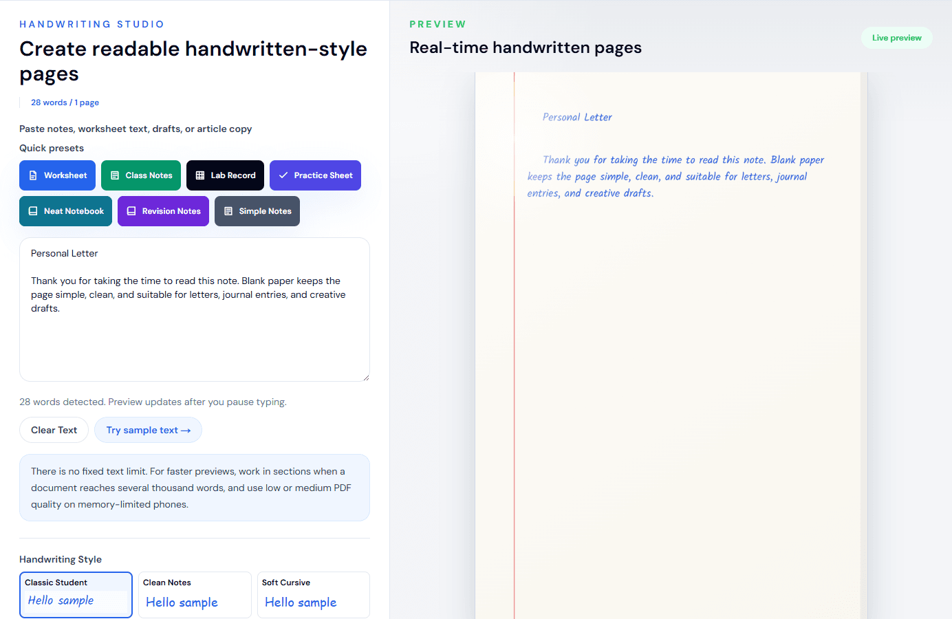
The most important adjustment is not a slider: shorten the source text. On a blank page, two or three compact paragraphs usually look more intentional than one uninterrupted block. Insert paragraph breaks where a person would naturally pause.
If the page feels too sparse, do not immediately increase the font size. First reduce the top margin slightly or add a short heading. Oversized body text often makes a short note look like a poster rather than handwriting.
Black ink gives a more formal letter or document draft. Blue ink feels closer to everyday notebook writing. Dark gray can soften a design preview, but check contrast carefully before printing.
Setting 3: Graph Paper for Lab Notes
The current Lab Record preset uses Lab Record, graph paper, black ink, font size 30, line spacing 1.50, word spacing 0.95, variation 0.28, left margin 155, and top margin 110.
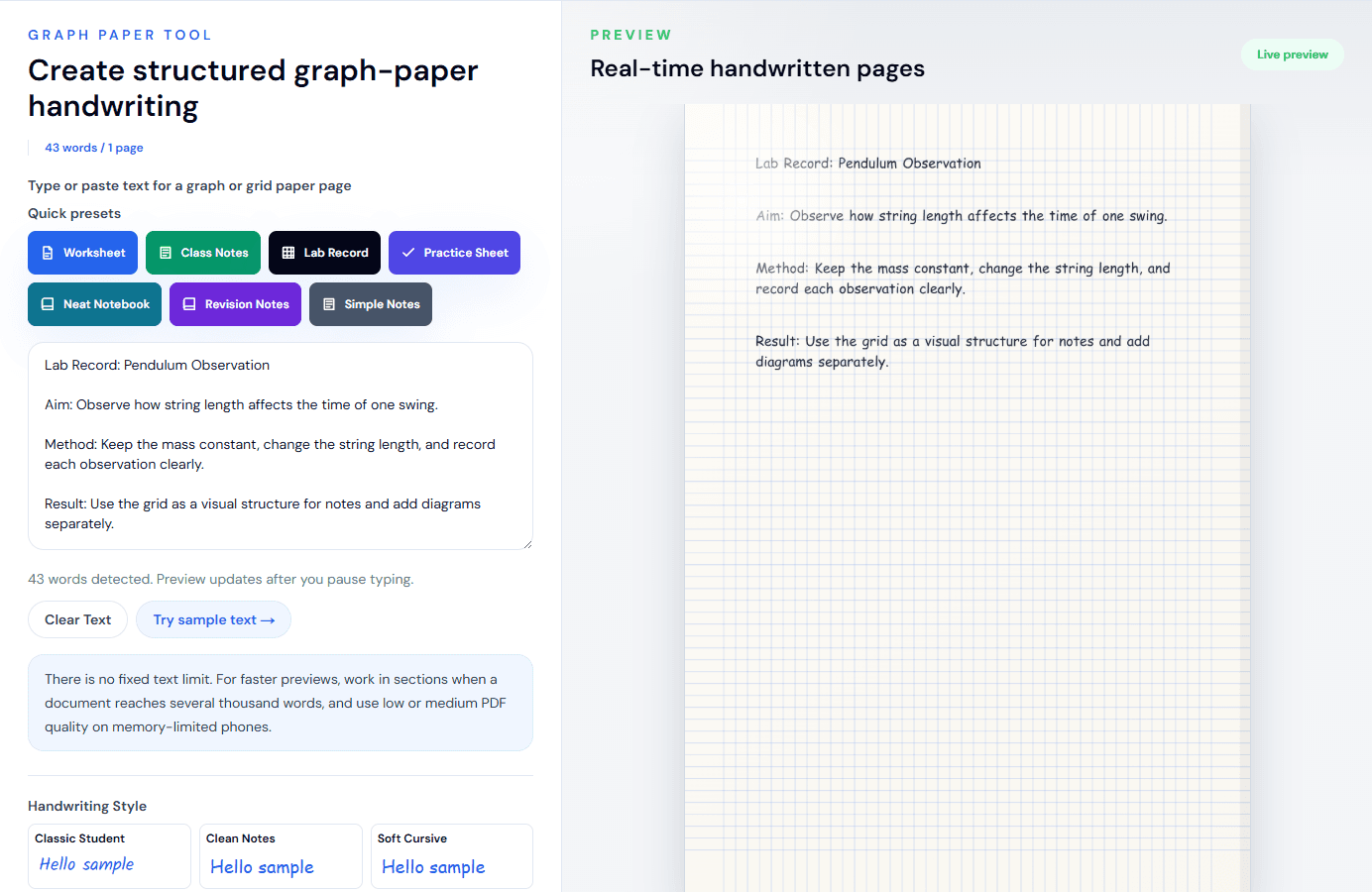
Keep each observation short. The grid is useful for alignment, but it also makes crowded paragraphs feel denser. A structure such as “Aim”, “Method”, “Observation”, and “Result” is easier to verify than a long narrative.
This tool renders plain text. It does not solve equations, parse LaTeX, create charts, or understand scientific notation. Verify symbols in the preview and add complex diagrams separately. The graph paper handwriting generator explains those limits directly on the tool page.
Setting 4: A Multi-Page Handwritten PDF
For a document that spans several pages, consistency matters more than maximum variation. Start with lined A4 paper, medium PDF quality, a readable style such as Clean Notes, size 31–32, line spacing around 1.50–1.55, normal word spacing, and variation between 0.24 and 0.30.
The screenshot below is a live long-document test. The converter detected 684 words and produced seven pages before export.
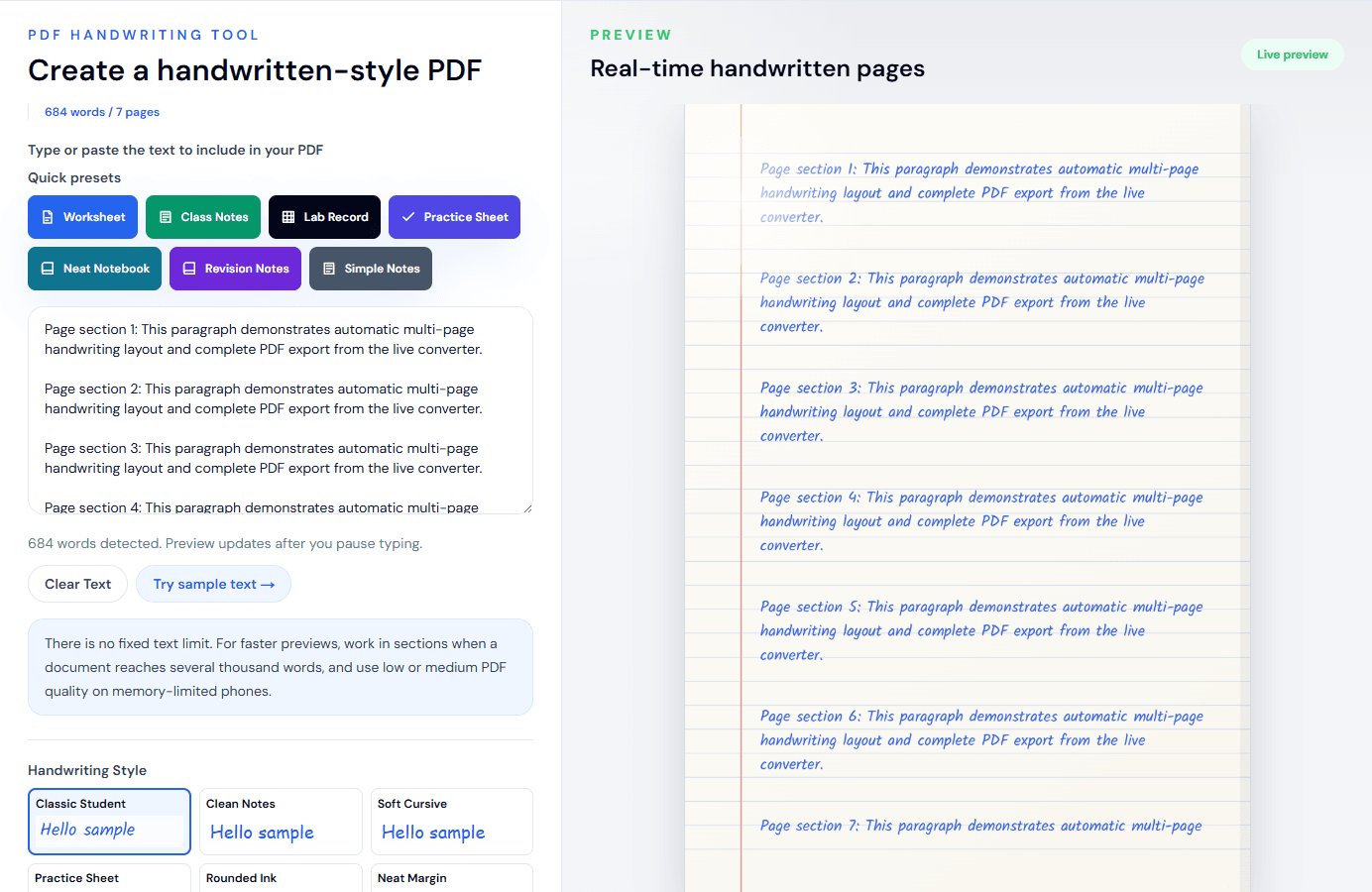
Before selecting “All pages”:
- Confirm the generated page count.
- Review the last line of every page for awkward breaks.
- Check names, numbers, punctuation, and symbols.
- Use medium quality first, particularly on a phone.
- Match A4 or Letter to the paper you intend to print.
High PDF quality uses larger canvases and more browser memory. It is not automatically the best choice for every document. Medium quality is the practical default; use high only when the additional detail is visible and the device handles the complete export reliably.
Open the text to handwriting PDF generator for the focused multi-page workflow.
How Much Natural Variation Should You Use?
Variation affects the small changes applied across character position, size, and angle. More variation is not always more realistic.
- 0.20–0.26: restrained and consistent; suitable for neat notes and longer PDFs.
- 0.27–0.34: balanced movement; a useful range for everyday notes and personal pages.
- 0.35–0.42: visibly informal; use after checking every line and page break.
- Above 0.42: a deliberate rough effect, not a safe realism default.
If the output looks robotic, raise variation in small steps of about 0.03–0.05. If the writing drifts away from ruled lines or becomes tiring to read, reduce it. Do not use variation to compensate for the wrong style or poor spacing.
Font Size and Line Spacing Must Be Tuned Together
Font size controls more than legibility: it also changes line length, paragraph wrapping, and page count. Line spacing controls vertical rhythm. Adjusting one without checking the other is a common source of poor output.
For lined pages, size 30–34 with line spacing 1.45–1.55 is a dependable working range in the current editor. If letters touch or crowd the next ruled line, lower the size by two points or raise line spacing by approximately 0.05. If the page looks empty, check paragraph length before tightening the spacing.
For graph paper, stay near size 30. For blank pages, size 31–32 works for ordinary body text, while short headings can be separated with a blank line instead of making the entire page larger.
Source Text Has a Bigger Effect Than Most Sliders
The converter preserves the text you provide. It does not rewrite or organize the content automatically. Clean the source before styling it:
- Remove copied page numbers, headers, footers, and broken line endings.
- Keep headings short.
- Split dense paragraphs into natural sections.
- Avoid long unbroken URLs.
- Use plain punctuation when a decorative symbol does not render clearly.
- Proofread before export; handwriting styling does not validate facts or spelling.
If text comes from Word or Google Docs, copy the useful text rather than expecting the original document layout to transfer. The Word-to-handwriting workflow covers cleanup in more detail.
A Practical Realism Checklist
Before downloading, ask:
- Does the style fit the page type and purpose?
- Are full paragraphs readable at normal zoom?
- Does lined text sit comfortably against the baselines?
- Is the left margin wide enough for the page design?
- Does the ink have enough contrast for printing?
- Are headings separated by spacing rather than excessive size?
- Have all generated pages been reviewed?
- Is the output being used honestly and within the relevant rules?
The most convincing result is not the most irregular page. It is the page where no single setting calls attention to itself. Start with a focused preset, adjust one control at a time, and judge the complete output, not the small "Hello sample" shown in a style picker.
For a broader workflow, read how to convert text to handwriting. For acceptable-use guidance, review the responsible use page.
Use the Converter Responsibly
HandwritingTool is best for readable notes, drafts, worksheets, examples, journal pages, printable resources, and document previews. Review your output carefully before printing or sharing it.